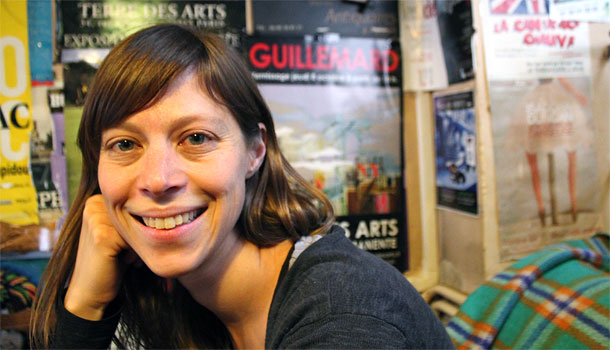
Katrina Gooding Petersen
Communication
San Diego
If you use your iPhone to find a highway exit, you’re part of a revolution. Thanks to smartphones with GPS capability and Google Maps, mapmaking has become an democratic enterprise. Bloggers and activists have helped create compelling digital images of wildfires in California, oil spills in Louisiana, secret prisons in Libya, slums in Brazil and catastrophic flooding in Arkansas.
UC San Diego graduate student Katrina Gooding Petersen is studying the 2007 wildfires in Southern California to ask hard questions about this radical shift in mapmaking. The fires killed a dozen people, forced a half million from their homes and caused an estimated half billion dollars in damage. Although government agencies primed by previous catastrophic wildfires in the region were lauded for their response, many residents found information on a map created from citizen input by San Diego radio station KPBS in cooperation with Google Maps and San Diego State University.
Question:
How is smart technology changing the face of disaster response?
Answer:
For one thing, institutions are not keeping up with the technology. There’s this amazing New York Times graphic that showed how a baseline map evolved during the first week after the earthquake in Haiti. The maps of Port-au-Prince were not very detailed or accurate, and so many places had been destroyed or moved that relief workers had to work with people who had lived in Haiti to translate the information they were receiving in text messages, and that’s how they created a map.
This brought up the question: How do we fill in the “real” map? Increasingly, people are mapping life itself: things like health effects and cultural loss, secret prisons, human trafficking. There’s something about life and movement that has to become incorporated into a map.
Question:
But the technology is still very new. How sophisticated is crisis-mapping? What did you observe at the BP oil spill when you went to Louisiana in 2010?
Answer:
The striking part was that the mappers were ordinary people. They were a bunch of volunteers who came into town from all over the place. The command post was half a house, the office for a small, grassroots group called the Louisiana Bucket Brigade. They had some volunteers who were techies, and they were using software to come up with the map.
There were also lots of non-technical people, including myself. We took part in two on-the-ground efforts. Some people made contacts with fishermen and arranged to fly kites with digital cameras over areas where they thought the oil had migrated. They used their cell phones to geocode, to get the GPS coordinates for the photos they were taking. They brought the phones and cameras back to the home office because the phones had the GPS coordinates and the cameras had the photos. The techies developed software to basically stitch the pictures together, because they were taken from different angles.
Question:
Ushahidi?
Answer:
Ushahidi means “testimony” in Swahili. In Kenya, during the disputed election in 2008, citizen journalists worked with techies to compose a map of violence related to the election, and 45,000 people ended up using that map. That’s usually acknowledged as the first crisis-mapping project. Now Ushahidi is a non-profit software company based in Nairobi that makes their software available to activist groups.
Question:
Is there a danger that groups providing information will replace government’s role? Or are we letting government off the hook for providing services?
Answer:
I don’t think that will happen. Even in disasters you traditionally have all of these organizations the government relies on, like the Red Cross. I do fear that with this new use of individualist technology that if you don’t have the technology, you won’t get the response. Of the dozen or so people who died in the California fires in 2007, about half were Mexican migrants in remote areas near the border, who either did not have cell phones or were out of cell phone range.
Question:
In the case of the California fires in 2007, the citizen input happened while the event was actually taking place. How did that work?
Answer:
KPBS, the public radio station, started by tracing the lines from the emergency office maps onto their Google Maps. But then a lot of people called in with information. They were using the KPBS map because the county map wasn’t as “zoomable.” You couldn’t get that higher resolution, which offered more detail.
Question:
What were some of the technical problems?
Answer:
What’s interesting is that 2007 was the early era of smartphones. The iPhone had only been released four months before. Google was still learning how individuals would use maps. But KPBS realized that people wanted to look on their computer and figure out things using maps. The government was issuing maps every 12 hours, but everybody wanted to get fire perimeters more frequently.
KPBS had its own problems. Their hosting couldn’t accommodate the map, so they had to switch, and then they crashed the Google My Maps server. At that point, Google got involved, and increased their own capability for updates.
KPBS had an incredible network because its office is located on the San Diego State University campus. The geography department stepped in to help, and so did a Taiwanese researcher who had just left the university. He was in Taiwan, but his satellite was still in place. His satellite was more accessible and faster than NASA’s so he just started sending pictures over. It was this beautiful coincidence.
Question:
The possibilities of participatory mapping seem endless, and the technology is so new. What are some of the new areas people are exploring?
Answer:
There are so many things you can map: people’s movements, sound. Because so much of a city experience is related to sound, people are looking into how to map that. Maps can also give us insight into our attitudes. In my work, I’m asking what kinds of assumptions about cities go into crisis management.
Question:
What would some of those assumptions be?
Answer:
How much we consider risk in choosing where to live. Do we want to have public transportation or use cars? Do we expect to have sprawl? How does the California dream, the Southern California lifestyle dream, shape our attitudes and influence our planning around disasters?
I’m also looking at which parts of the threat we choose to map. Air quality doesn’t get mapped, but it’s part of the changing fire situation.
Question:
The idea of mapping the California dream is fascinating.
Answer:
Yes. You forget the risk. You’re choosing to live in these spaces that are prone to big events. It’s one of the things I find so fascinating. Disaster and everyday life.